Internal Operational Tooling
The Measurement Operations team at Samba TV managed critical campaign reporting workflows that directly supported client analysis, publisher coordination, and operational reporting. However, many of the tools supporting these workflows were fragmented, manual, and poorly understood by internal teams. I focused on redesigning the legacy Master Placement Report uploader experience to reduce operational friction, improve workflow clarity, and reposition the system from a passive upload tool into a more effective validation experience. This project required balancing operational realities, legacy systems, stakeholder alignment, and future scalability within a complex enterprise environment.
What we set out to do
The redesign aimed to:
- Improve the usability of the Master Placement Report workflow
- Reduce manual reporting and validation overhead
- Help users better understand validation processes
- Improve operational efficiency across campaign reporting
- Explore more scalable and integrated workflow patterns
What changed
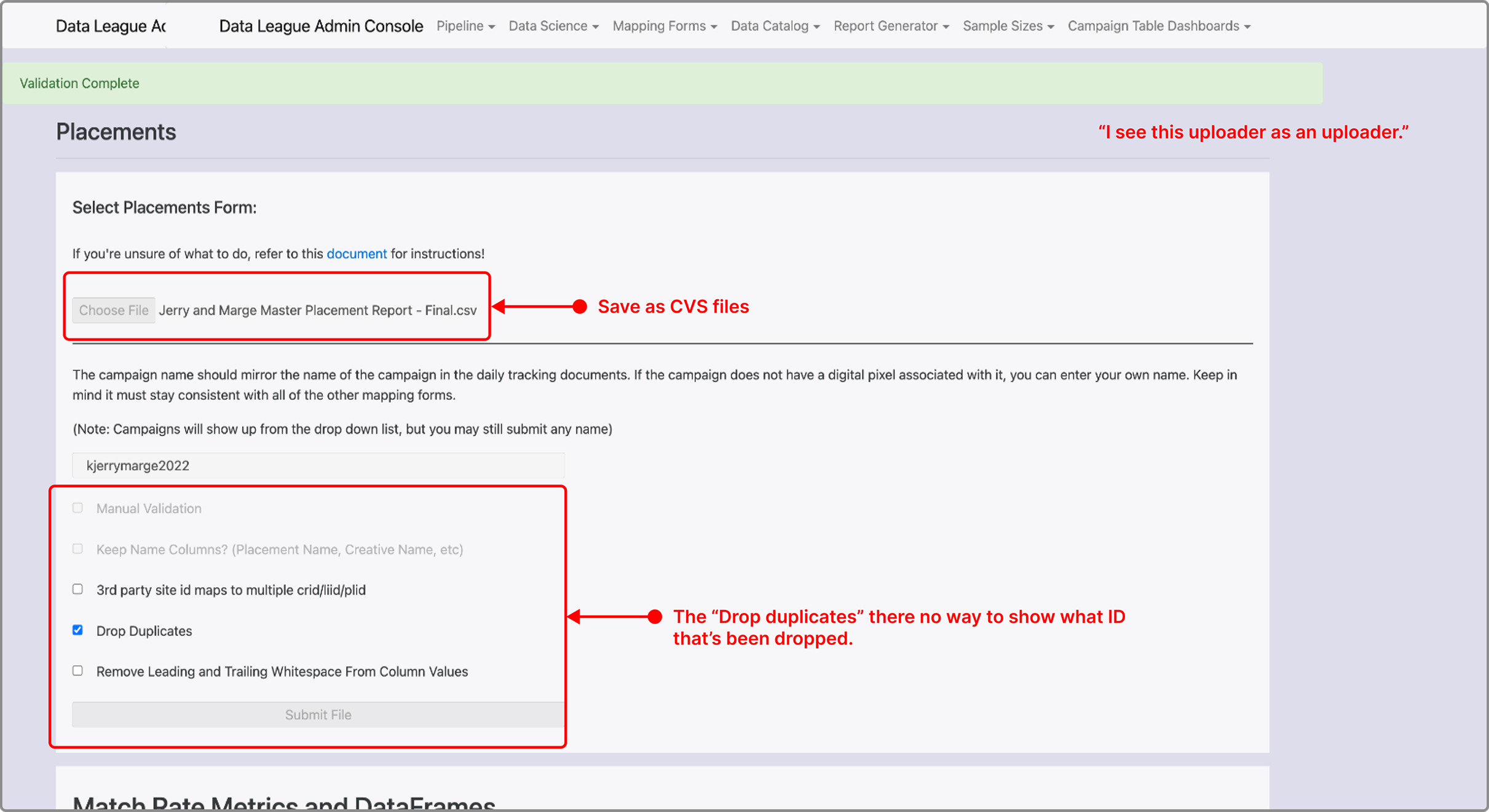
- The uploader existed as a disconnected legacy system outside the broader Samba TV ecosystem.
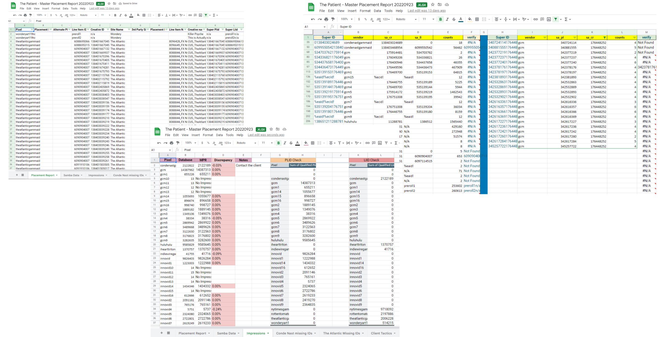
- Teams relied heavily on Excel and Google Sheets for day-to-day operational workflows.
- Engineering terminology created usability challenges for non-technical operational users.
- Organizational priorities later shifted toward replacing portions of the workflow entirely, limiting implementation opportunities.
What limited us
- The uploader existed as a disconnected legacy system outside the broader Samba TV ecosystem.
- Teams relied heavily on Excel and Google Sheets for day-to-day operational workflows.
- Engineering terminology created usability challenges for non-technical operational users.
- Organizational priorities later shifted toward replacing portions of the workflow entirely, limiting implementation opportunities.
What was broken
Manual Operational Workflows
Users spent significant time manually reviewing discrepancy reports, identifying missing information, and validating campaign data.
Misaligned Product Mental Models
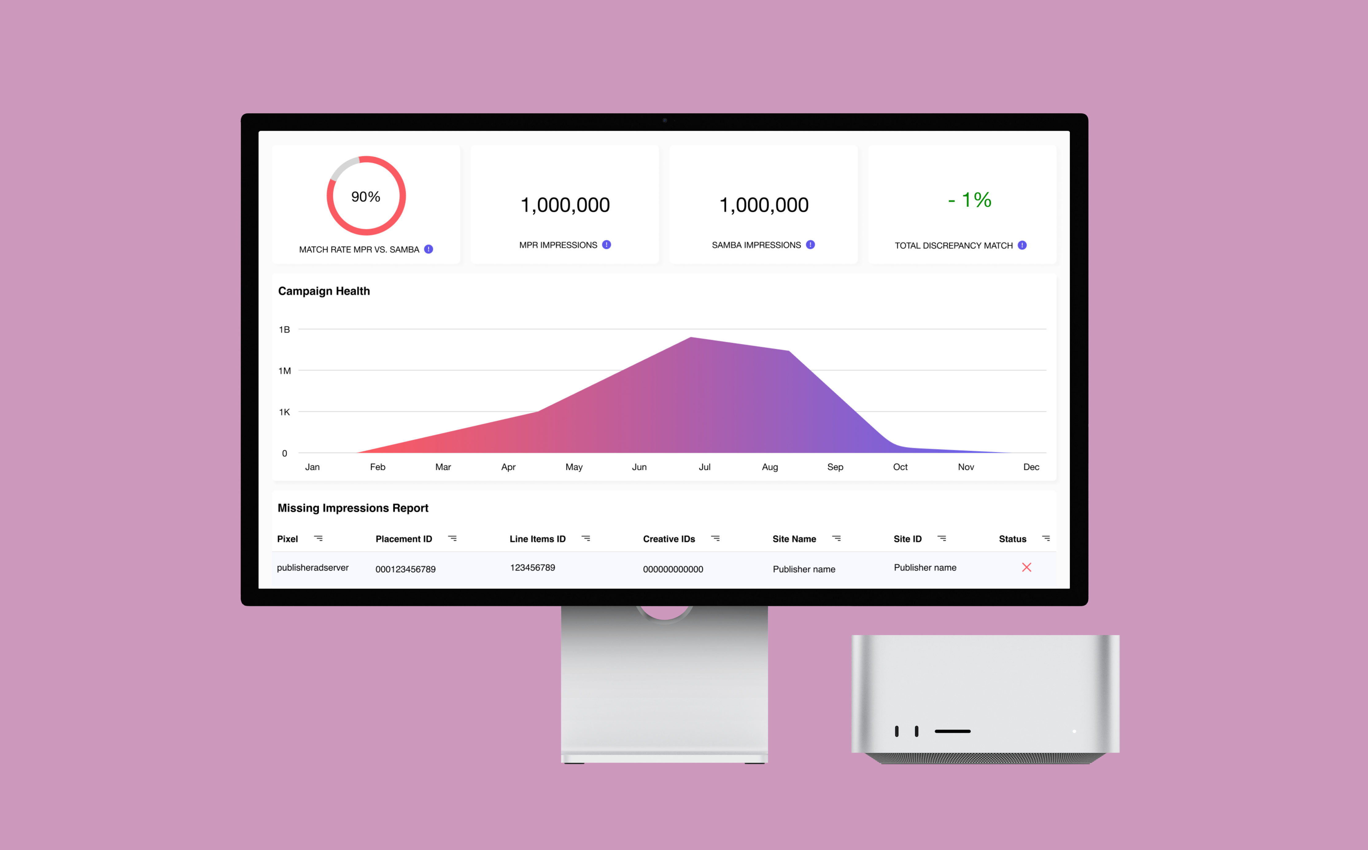
The uploader was originally designed as a validation tool, but users primarily perceived it as a file storage system. This disconnect reduced adoption of important verification behaviors.
Technical Language Barriers
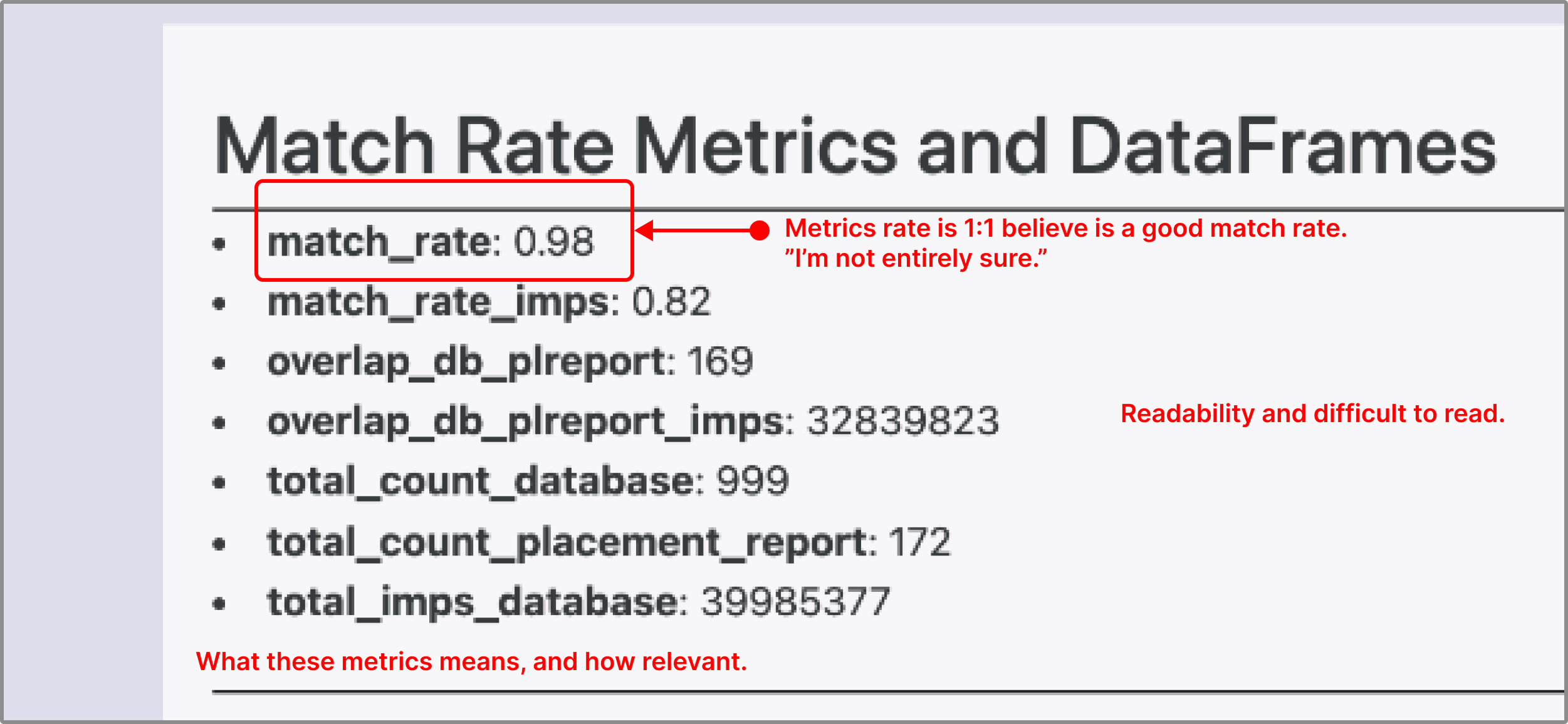
Internal metrics and engineering terminology created confusion around how uploaded reports connected to campaign systems and reporting outcomes.
Operational Communication Delays
Campaign success often depended on external publisher responsiveness, creating bottlenecks and downstream reporting delays.
How I solved it
I interviewed five members of the Measurement Operations team to map the full campaign workflow and identify operational pain points.
I then conducted usability testing on the existing uploader to better understand how users interpreted the system and where confusion occurred.
Reframing the Workflow
The core opportunity became clear:
The uploader needed to function as a validation-centered operational tool rather than a passive upload destination.
To support this shift, I explored:
- Clearer validation feedback patterns.
- Missing-data visibility systems.
- Simplified terminology.
- Spreadsheet-inspired interaction patterns aligned with existing user behaviors.

Product Inspiration & Workflow Alignment
I researched tools already embedded in the team’s ecosystem, including:
- Excel
- Google Sheets
- Superset
- Jobscan
These products influenced ideas around filtering, missing-data dashboards, validation feedback, and operational visibility.
Guided Error Resolution
Rather than presenting users with technical validation failures, I explored a more human-readable review experience inspired by spreadsheet workflows and data QA tools.
The redesigned experience surfaced:
- Highlighted row-level issues
- Suggested fixes
- Missing field explanations
- Status indicators for validation progress
This helped reduce ambiguity for operational users who were not deeply familiar with engineering terminology.
Future-Facing Systems Thinking
Beyond redesigning individual screens, I explored how the uploader could integrate more directly into Samba TV’s larger reporting ecosystem.
This repositioned the workflow as part of a broader operational analysis pipeline rather than an isolated legacy system.
What it became
The project uncovered several foundational workflow inefficiencies and created a stronger UX direction for improving campaign reporting operations.
Although the redesign was ultimately paused due to broader organizational process changes, the research and system recommendations helped clarify how future workflows could become more scalable, integrated, and operationally efficient.
The project also highlighted the importance of aligning product mental models with actual user behavior — especially within enterprise tooling environments.
What I learned
This experience deepened my understanding of enterprise UX, operational systems, and organizational prioritization.
One of the biggest lessons was recognizing that successful product work is not only about usability — it also depends heavily on timing, business priorities, technical investment, and long-term strategic alignment.
Even though the redesign was not implemented, the research itself created value by surfacing operational blind spots and helping stakeholders rethink how campaign workflows should evolve moving forward.
The project reinforced how UX can influence not just interfaces, but operational systems, communication patterns, and organizational decision-making at scale.
Let's figure out
something
great together ❖
Whether you've got a role, a project, or just want to talk design — I'm genuinely happy to hear from you. No pressure, no pitch.